Let your 404-Page Not Found be a Marketing Win
Your 404 page is a great opportunity to strengthen your brand - and perhaps delight your customers at the same time.
Note: To see more and updated examples, head over to this post.
Even if your website is brilliant, at some point, someone is going to land on a 404 page. (It’s the page that pops up when the URL isn’t correct - “Page Not Found.”)
It can happen for various reasons - but that topic is wayyyyyy too complicated and technical for me to address here. So let’s just make sure that if a visitor does land on yours, the experience helps your brand rather than hurts it.
Most 404 Pages fall into one of these categories:
The generic fallback/boring page (don’t do this).
Slightly branded, but doesn’t really connect the dots or help the user do anything.
Really, really good (let’s focus on those).
1 | Graduate Hotels
Update October 2023 - they don’t have this page anymore! They need to read this post. Anyway, I am leaving this here because the old page was good!
These hotels are always near college campuses - get it? GRADUATE Hotels. The audience often comes into town for a game, to see their kids, to look at schools, or just love a good college town. Thus, this is cute, speaks in their brand voice, and is useful. And if you scroll down, you will see the footer. Their call-to-action is either back to the Home Page or to Reserve a Room, which is what most people probably want, anyway.
2 | MM.LeFleur
100% on-brand and I like the fact that they give you categories below (I couldn’t get all of that into one screenshot). And, note the chatbox in the lower right. They do have their menu at the top, which you can’t see and a footer. The girl who says, “oops!” is a familiar face throughout the site, so it’s someone you may have already seen and know.
3 | Emirates Airlines
Emirates did a good job with this. Beautiful, smiling flight attendants saying, “hey, this wasn’t your fault, but ours!” Then, they give you links below to help you get back on track. I feel like the 404 and the gears could be a little more on brand, but the idea is great.
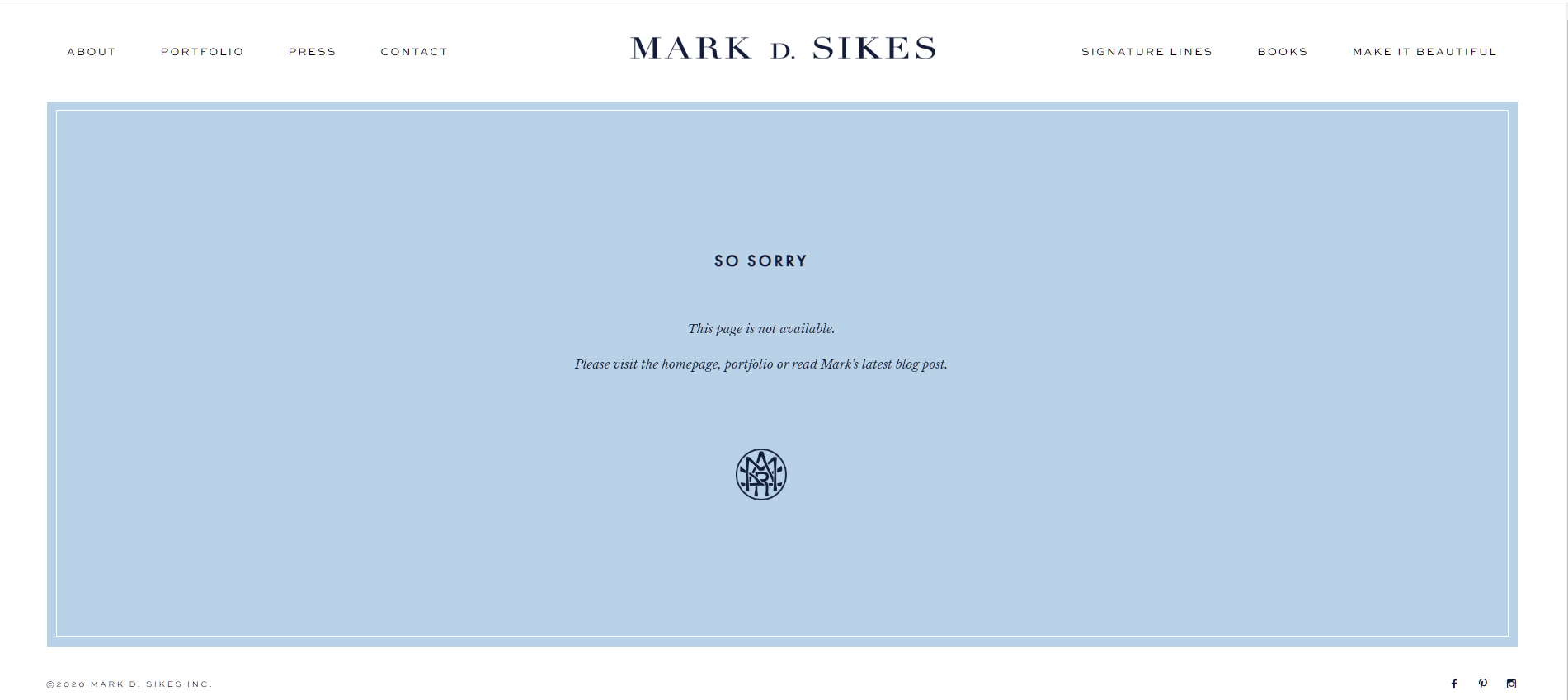
4 | Mark Sikes
Now, this one from Mark Sikes (and the one below) doesn’t get huge points for creativity, but he is completely on-brand. It’s simple, sophisticated, and elegant, just like his designs. I wanted to show this one and the one below to show that simple can be just perfect.
5 | Bunny Williams
Again, I would like to see a little more creativity (what about for interior designers, a space that is under construction and a tagline like, “oh no! this is not the room you were looking for!” Anyway, it’s still so much better than the generic.
6 | Amy Porterfield
How much fun is this? Amy is also fun and entertaining and loves music, so again, 100% on-brand. I love that she points you right to her Cheat Sheets, since she is the BOSS of list-building. You can click on her navigation bar, but she wants you to sign up for her sheets, so she makes that the easiest thing to do.
What not to do-
Okay, so before you see the last six, here are two that make me sad. They are from great brands and unfortunately this is what you see most often. If your website has anything similar to this, please fix it. Or just call me - we will fix it together. Please.
Okay, back to clever and smart . . . . .
7 | Airbnb
Airbnb has done a good job with this animation. If you go to the actual page, you can see that the girl starts out smiling with her ice cream cone and then her ice cream falls. I’m not exactly sure what the ice cream has to do with travelling, but it is relatable and it fits. Just as important, it gives the user options to get where they wanted to go. Also note the Search bar at the top of the page.
8 | drybar
This is a salon that only does one thing: they wash and blow dry your hair - that’s it. This could not be any more on-brand, but I do wish that they helped you get back to where you wanted to go in the first place.
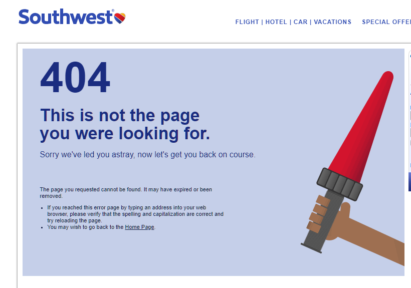
9 | Southwest
Similar to Airbnb, Southwest has an animated page (the red directional thing moves back and forth). 100% on-brand and some tips to help you out.
10 | The Masters
This gets 100 points for cleverness and being on-brand. I only wish they gave the user an option to find what they were originally looking for. If this is someone who doesn’t understand 404/Page Not Found, they might be confused. However, you do have the navigation bar at the top, which most likely works. Unlike Emirates, they tell you it was your fault, but that even happens to Tiger Woods.
11 | The Dwell Hotel
This boutique hotel in Chattanooga keeps it simple, but elegant and fun. Chances are, their visitor is looking for information about the hotel or one of their restaurants which are all right here. It also educates the visitor who may have not known about the restaurants.
12 | Marie Forleo
If you don’t know Marie Forleo, she IS her brand and this is 100% her personality, so it is perfect. Her copy is spot-on and she gives you options to get out. And, note that you can also watch a video. Smart. (but so is she).
So there you go. Twelve examples of (mostly) well thought-through and branded 404 pages.
This is something you should do today. There are so many customer touchpoints that we don’t have control over. What an easy way to turn a bad (not a crisis, but still not good) experience into a better one.
Note: if you’ve read this and what to see new examples, head over to this post which I wrote in April 2022.
ps
(perspective shift)
your 404 page is not a mistake page. It's yet another opportunity to define your brand and connect the dots in your customers minds.


